Adding Impact to your images
John Warren – September 11, 2016
Introduction
The quality of the images coming out of our digital cameras these days is quite stunning compared to what we used to get from our cameras years ago. Even the compact all-in-one and cell phone cameras produce great results but, no matter which brand or model you own, some images still still could benefit from a little post production images enhancement. I remember when I first started using digital cameras, I was always somewhat disappointed with the results when the images first came out of the camera. Although camera manufacturers have raised the bar so high with respects to image quality, some images just don’t match up with what my mind’s eye pre visualized just before I tripped the shutter. If you have ever shot colour slide film and then compared that to photographic prints from the lab, you’ll know what I mean. The prints were always flat in comparison to slides film and, if you ever had a Cibachrome print made from those slides, you will really understand where I am coming from. Adding impact to your images will be the focus of my article today. Not all images require this “impact” but the ones that do, will greatly benefit from this technique.
Using the Apply Image command in Photoshop
As you can see in the series of images above, on the left is the original image as it came out of Adobe Camera Raw which I’ll refer to as ACR from now on. Please also note that when I use the phrase ACR I also mean the Develop Module in Lightroom.
Now I could have probably achieved a similar look in ACR but it wouldn’t be quite the same as using the Apply Image command in Photoshop. The Apply Image command allows us to blend our images in fascinating ways and even allows us to create very quickly, channel masks which limit these effects to certain areas of our images. Since I want to keep this tutorial simple, I will just blend the image into itself and only play around with the Blend Mode and the opacity of this blend. Later on we can explore this feature in more detail.
So let’s open up and image that we would like to add some impact to. After opening this image up in ACR and doing a few “normal” things like making sure my highlights and shadows are not being clipped, sensor dust removal, some sharpening and maybe just a nudge of clarity, I opened it up in Photoshop.
I am sure I could have enhanced this image a little more in ACR but knowing that I can do so much more in Photoshop, I decided to stick with just the basics. All in all, it’s not a terrible rendition of what I saw when I clicked the shutter but in my mind’s eye there was more impact, punch, vibrancy or whatever you want to call it and it’s not here right now.
The other factor is that I was on vacation and we all know how everything in life is much nicer and more beautiful when we are on vacation, even our pre visualized images.
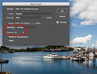
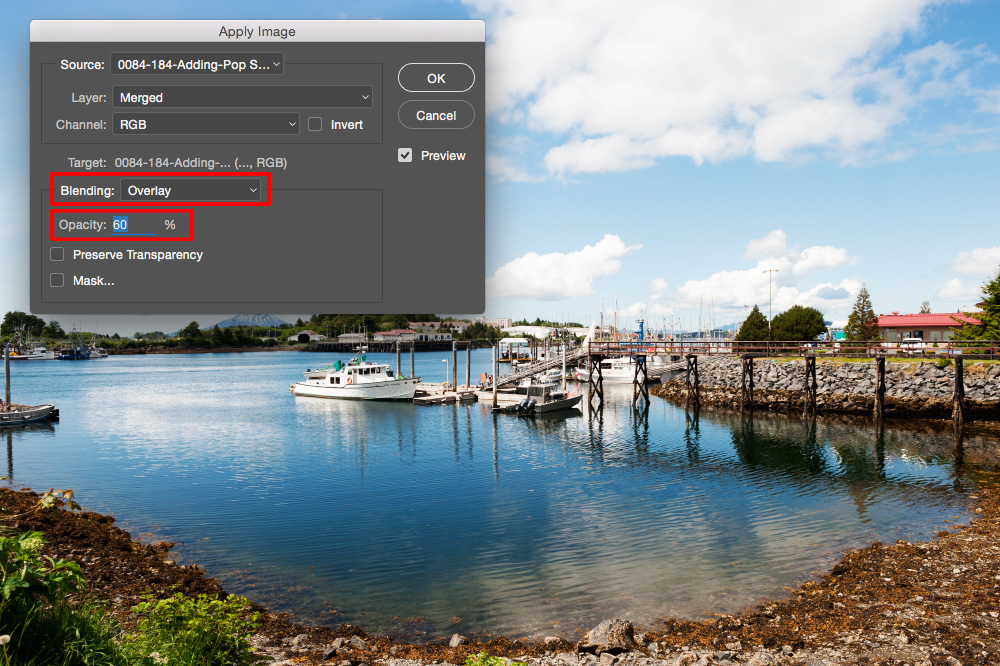
Ok, so the first step is to duplicate your Background layer and then go Image > Apply Image. In the resulting dialog box, change the Blending from Normal to Overlay and the Opacity from 100% to 60% and click OK.
Just a quick note about Photoshop’s Blending Modes … Of the over twenty different blend modes available there are only a handful that are of any use to photographers on a regular basis and they are Normal, Multiply, Screen, Overlay, Softlight, Color and Luminosity. I will explain what these blend modes are all about in a future article named “Understanding Blend Modes”. If you were to toggle the Preview checkbox on and off you will notice that in our image, the light areas got lighter and the dark areas got darker hence the reason I chose to reduce the
opacity down to 60%. At 100% opacity the image would have been too contrasty. Now, I want to limit the effects of this Apply Image enhancement so only the mid tones are affected and the highlights and shadows are not. In order to do that we need to bring up the Blend Options dialog box and there are two ways to do that. One is to go to the menu across the top and go Layer > Layer Style > Blending Options … or just double-click to the right of the layer name in the Layer’s Panel.
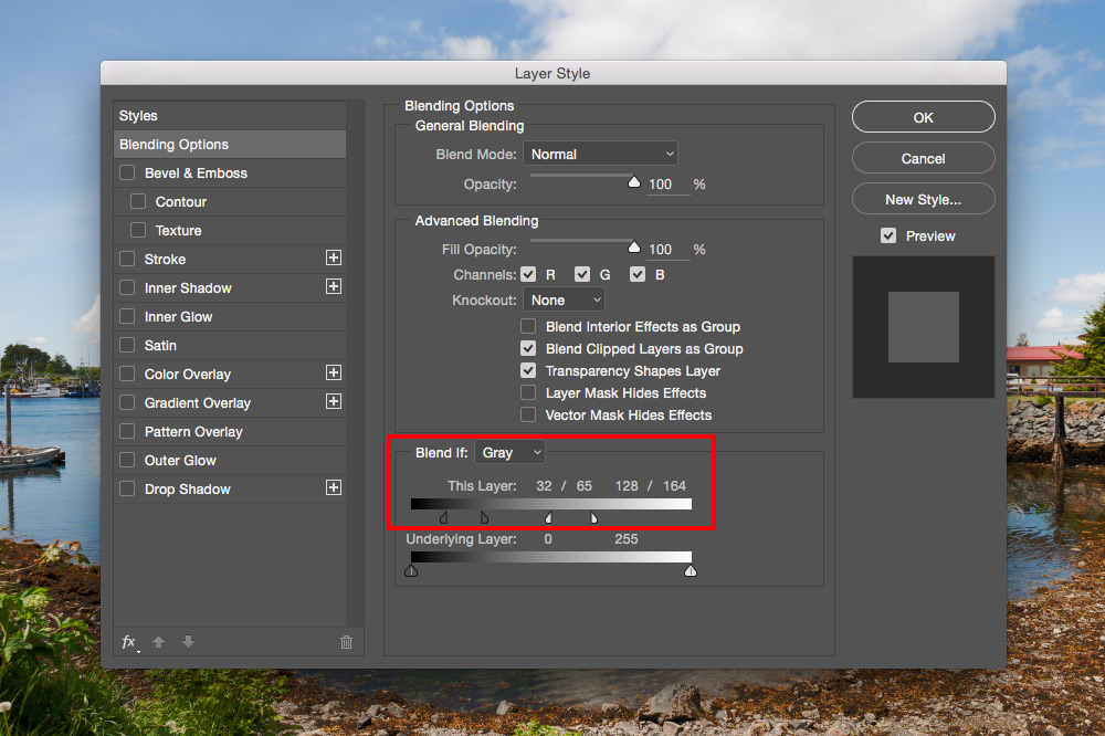
Although this dialog box has many options for us to play around with, I want you to only focus on the “Blend If” sliders and in particular, only the “This Layer” sliders.
There are shadow sliders and highlight sliders. Also, these sliders can be split in half to create a transition between what is included and excluded on this layer based on brightness values. To split a slider, hold down the Option (Mac) or Alt (Win) key while hovering over a slider and then drag away. Here I dragged the shadow slider to a brightness value of 32 and then split it to 65. In the highlights I dragged this slider to 164 and then split it to 128.
Now I want to darken the image slightly and I’ll do this using a Curves Adjustment layer but, I want to darken the mid tones and highlights more than the shadow areas. The best way to do this is to use a layer mask to limit the amount of the “darken” effect in the shadow android tone regions. Normally people would just paint with black on the mask to hide the effect but instead I want this “darkening” effect to feed through the tones of the image in a more organic manner. In order to do this I am going to load just the luminance values as a layer mask. Confused? I don’t blame you if you are at this point.
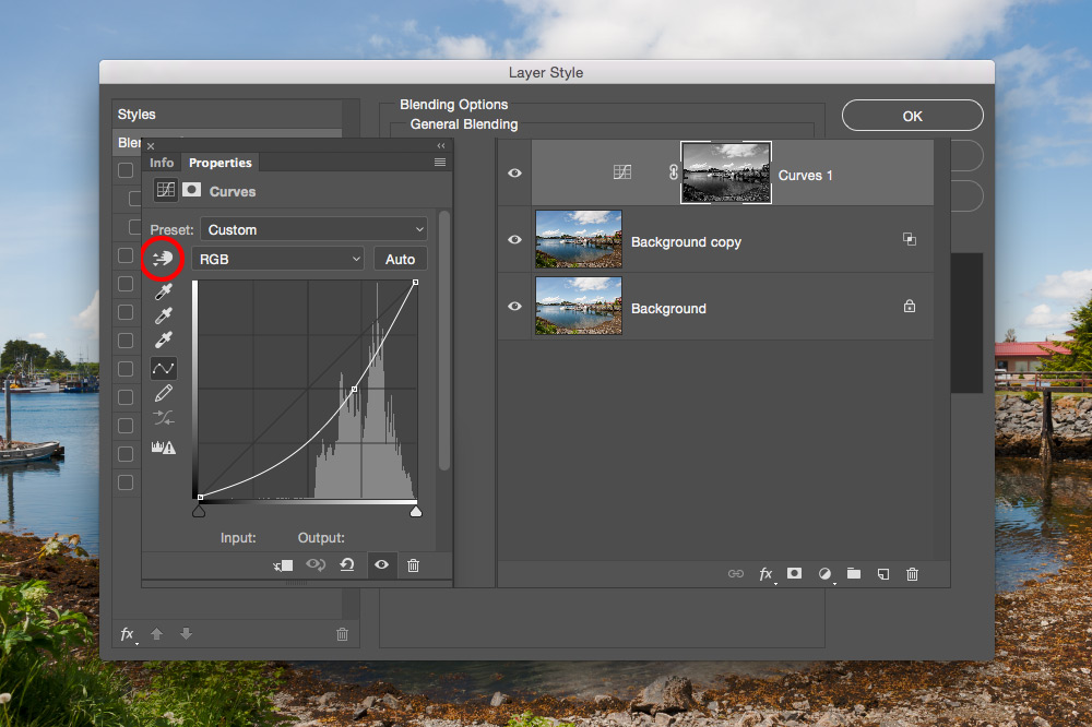
Let me explain how to do this. Click on your Background layer to make it your active layer in your layer’s panel. Now click on the Channel Panel to reveal your channels. Hold down the Command (Mac) or Control (Win) key and click once on the RGB Channel. This loads the lightness values as a selection in your image. Now click back on the Layer Panel togged back to familiar territory. Next click on your Background copy layer and then go Layer > New Adjustment Layer > Curves … Notice that your layer mask looks like a black & white version of your image. Your curves adjustment will be fed through the lights and darks of this layer mask. In the Curves dialog box choose the Target Adjustment Tool and click and drag down in a light mid tone area to darken your image.
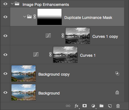
I like what I have going on here but I think I want the sky area to be a little darker. If I duplicate this Curves Adjustment Layer, the sky gets darker but so does the foreground and I do not want that to happen. I want to only darken the sky portion of the image. I guess I could just paint the lower portion of this duplicated layer mask with black but I would rather just place this duplicated adjustment layer in it’s own folder or group and then add a layer mask to the group and then drag a black to white gradient on the folder’s layer mask maintaining all of the subtleties of the adjustment layer’s mask. I think the image below will best describe what I am talking about.
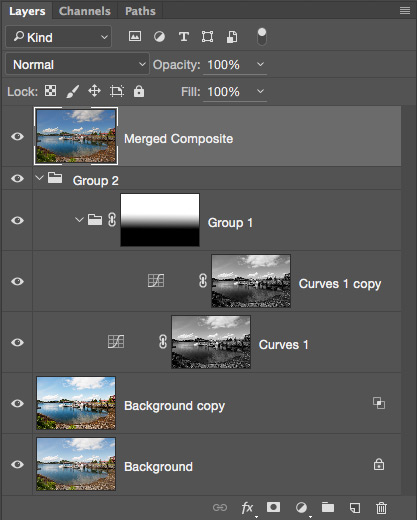
Toggle the layer’s visibility icons (the Eyeballs to the left of the layer thumbnails) to see what each layer is doing. If you wish to make any changes, just select the layer you want to adjust and make any adjustments you like. Once you are satisfied click on the “Image Pop Enhancements” folder and make a merged composite by holding the Option (Mac)/Alt (Win) key and choosing Layer > Merge Visible.
At this point I think this image looks great with the adjustments outlined but you may disagree. Don’t forget that any adjustments I have made here are only suggestions and you are free to change whatever settings you wish.
Now, as an added measure I am going to use a plug-in from the Google NIK Collection. Some of you may remember this as being NIK Software before Google bought them out a few years back. Anyways, this software is FREE and can be downloaded from the following link:
https://www.google.com/nikcollection/
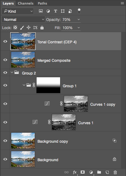
The feature I am going to use is called Tonal Contrast. For the most flexibility when adding effects of any nature, I suggest you do so on a duplicate layer. So duplicate your merged composite layer and then go Filter > NIK Collection > Color Effects Pro 4. Scroll down the list on the left hand side of this somewhat daunting interface and locate and choose Tonal Contrast. At first try using the default settings and click OK. The layer should get renamed to Tonal Contrast (CEP 4), which is always nice to have done automatically for you.
As you can see here, I have reduced the opacity of this layer to 70% as I felt at 100% opacity the effect was too strong. You may disagree and adjust differently. Save your work. One thing I can’t stress often enough is to save your work early in the creation process and then save often. After all, it’s only a Command (Mac) or Control (Win) + S after the initial save.
Original out of Adobe Camera Raw
Merged Composite Apply Image and …
Tonal Contrast layer at 70% opacity
All of the steps mentioned here can be put into an action which is a subject for another article in the future. Also, understanding how to use the Google NIK Collection can be somewhat overwhelming to say the least and I plan to create articles on how to use these plug-ins in the future as well.
 Subscribe to my Youtube Channel here: http://tinyurl.com/zu4vzyn
 Follow me on Twitter here: http://tinyurl.com/znvyvnu
 Follow me on Facebook here: http://tinyurl.com/qxh73jh
 Online Training Courses at Udemy here: http://tinyurl.com/huczemc
(Discounted down to $25 for PhotoNews.ca subscribers)


