At first blush, some of these results look really cool and one is tempted to apply the newly discovered technique to everything. That’s actually not a bad idea. It’s a practical way to learn where a particular technique works, and just as importantly, where it does not.
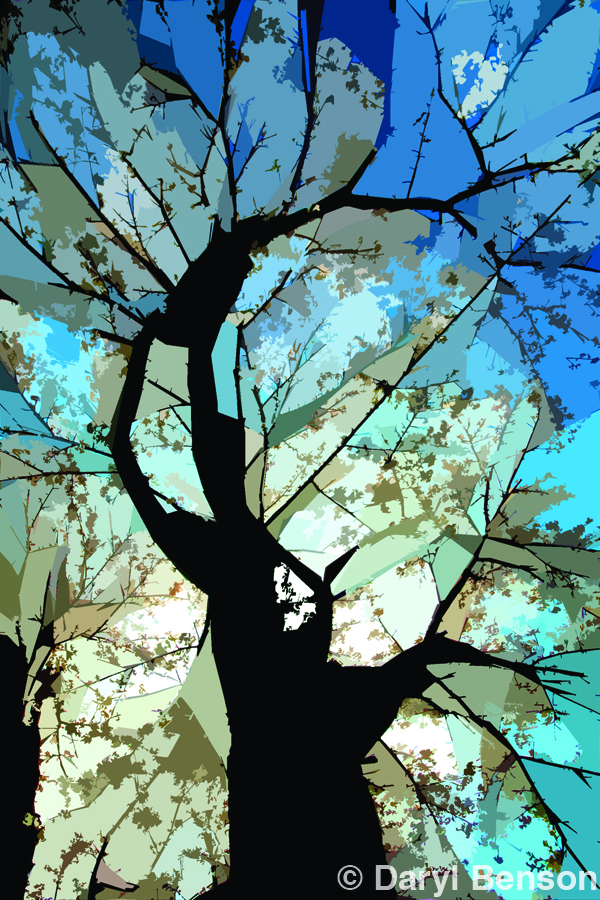
I can remember when I first got a fish-eye lens (1989). I shot almost everything with that lens for a couple months. “When you get a new hammer, everything looks like a nail.” Everything looked so cool through the viewfinder! The problem was that compressing a 180-degree view into a 35mm frame made everything tiny and the whole composition quickly became visually chaotic. I slowly discovered where that lens worked best and how to take advantage of its unique effect (best used in simple compositions where you can isolate on a single subject, see image one Cherry Tree). The same holds true for all lenses, filters, gadgets, doodads, and digital techniques. Learn – through experience – where they work for you. There are tools made for almost every imaginable situation – I know because at one time I owned most of them. Through experience I’ve learned which are worth carrying around and which aren’t. You have to discover that for yourself, but it is not the gadget or technique that continually creates images. It is the mind and imagination in behind all that technology that creates images.
 |
| Cherry Tree The original image was shot with a fish-eye lens looking up through the branches of a backlit cherry tree. using the Cutout filter in Photoshop’s Filter Gallery helped create this more graphic version of that original image. |
There are several interesting effects within the Filter Gallery section of Photoshop. My favourite of these is the Cutout filter. The effects within Filter Gallery are all very distorting to the image so there’s no reason to take a lot of photographic detail into these filters. Because of that fact it’s okay, and helpful, to decrease the image size to something more manageable for the software. I’ll usually reduce the image to something in the 8 to 12 MB range, e.g. 8″x5” at 300PPI. Sometimes going really small will create a more dramatic effect with these filters. As well, the smaller the file size the quicker Photoshop will be able to render the effects in the preview window, allowing you to work more visually.
 |
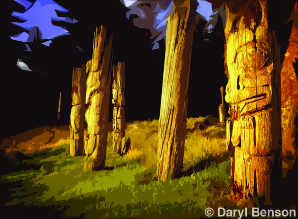
| Homage to Emily Carr The original image is of mortuary poles at SGang Gwaay, Gwaii Haanas national Park Reserve and Haida Heritage site, BC. By applying the Cutout fil- ter at different settings to copies of the image, each on a different layer in Photoshop, and then blending them together through layer masks created this ver- sion. This subject and style remind me of the work by Emily Carr. |
Go to Photoshop’s Menu, Filter > Filter Gallery. Clicking on this will launch a window, within Photoshop, that will take up your entire screen! There are a series of more than 45 filter effects nestled in folders within this display. You’ll see them in the middle windowpane listed in categories: Artistic, Brush Strokes, Distort, Sketch, Stylize and Texture. Click on the little triangle beside each name to view the list of individual filters in each category. The image you’re working on will be displayed in the large left hand windowpane and will update to reflect whatever filter you have selected. The smaller the file size the quicker the update. The windowpane at the far right will display the set of creative controls you have with each filter. To start, it’s best to work with these visually by just dragging the sliders back and forth to see what effect they have on the image. Keep in mind these effect sliders are reciprocal. One will affect the results of the others.
 |
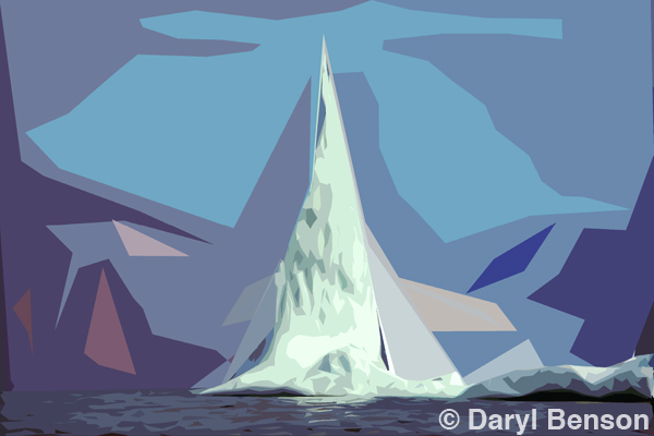
| Homage to Lawren Harris The original image is of an iceberg pinnacle off the coast of Baffin Island. using the Cutout filter in Photoshop, at various settings and blended together in Layers, created this image that reminds me very much of the visual style of Canadian group of seven painter Lawren Harris. Or viewed another way it could be a slightly lopsided f-14 Tomcat. |
At the bottom of the right hand windowpane is an icon to create a new effect layer within the Filter Gallery. This allows you to combine several of the effects in one image. I never use this as I prefer to combine effects by applying these filters to the image on separate layers within the Layers Palette in Photoshop. This way you have access to all the various Blend Modes, Opacity settings and masking options in Layers. This is explained in more detail in Part II of the YouTube tutorials. In the examples shown in this article, the Cutout filter was used, at various settings, to copies of the original image, but each on it’s own layer. That way the effects can then be combined by painting on a layer mask to creatively blend them all into a more handcrafted composite. I find this is the technique that works best when using the Filter Gallery. Any of the filters by themselves look cool at first, but tend to become stale and a bit predictable. Being a little more imaginative in how these filter effects are applied and then combined, through multiple layers helps bring the human element back into the creative process, rather than just a one-click wonder in Photoshop.
By Daryl Benson
| PHOTONews on Facebook | PHOTONews on Twitter |


