
These strips of accidentally unexposed film were laid across my flatbed scanner and copied to create a digital version of real film. Now they can be combined with any digital image.
You old school photographers might remember having the experience of getting to frame 38 on a 36-exposure roll of film. Those who remember even further back – before auto film load and rewind – will perhaps also recall hand winding the exposed film back into its canister. There would be a small amount of tension as you turned the tiny crank, this was normal. When you didn’t feel that small resistance it was a clue something had gone wrong. Either the film had broken or – more likely – it hadn’t been loaded correctly and you’d been shooting blanks. I made this error, more than once, and it usually happened when I was in a hurry to change rolls because the rainbow was fading, the animal was leaving or my model was losing his grip. When this happened I would develop the film anyway in a vain hope that something may have been captured, of course nothing had and the entire roll came back as black unexposed film.
I kept those black rolls of film, they still owed me! I’ve since scanned them and now combine their digital likeness with images creatively in Photoshop. The old world look of film combined with new digital techniques can work beautifully together to visually reinforce the message of the medium these are created in. The same way a subtle texture of canvas and brush strokes can help communicate painting, watching a live music performance can visually add to the enjoyment of the music or touching a sculpture can bring another level of appreciation to the figure.
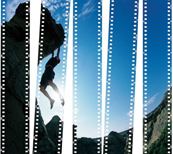
In Photoshop, with the blank filmstrips on the bottom layer and the image you want to combine on the top layer, simply change the Blend Mode to “Lighten”. The top layer image will only show up over areas that are dark on the bottom layer, in this case the filmstrips. It’s just that easy.
There are countless textures, edges and techniques that can be applied to images digitally, there are no rules but I’d like to share three suggestions,
- Keep the textures subtle, if a texture is too strong it can visually overpower the image.
- Try to be conscious of context. Does this texture or border make sense with this image? A hard visual texture of steel plate probably won’t look good combined with a soft focus image of roses.
- If you’ve got a vision don’t let any suggestions stop you.
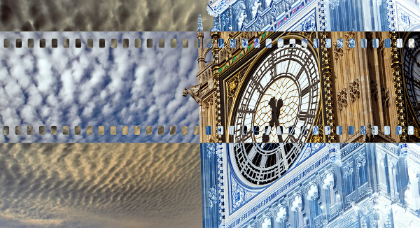
This is the same technique as seen in the image “Hanging on” only with a single filmstrip and the Blend Mode changed to “Exclusion”. Try Inverting (turning negative, Command I on a Mac, Control I on a PC), the top layer or bottom layer for varying effects.
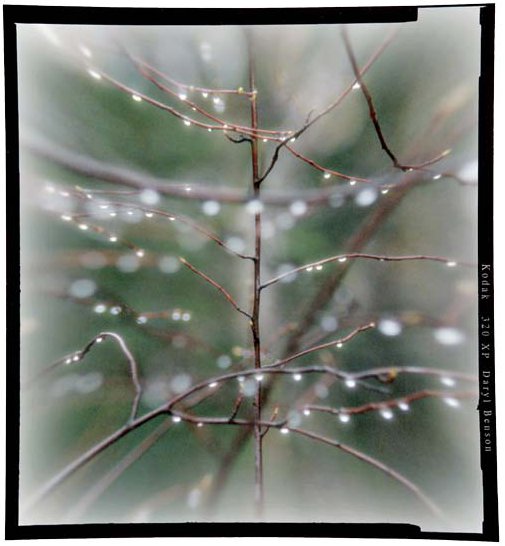
Similar to the 35mm filmstrips this was a blank, medium format film edge I’ve scanned and can now combine with any image. As part of the process when working on photographs I usually like to darken or vignette the corners. However, when combining images with this particular edge I find lightening the photographs corners helps this film border stand out and makes it a more noticeable element to the overall image. As mentioned in the winter issue of Photo News a good choice of font that visually reinforces the image can do more than just provide captioninformation it can also become part of the total presentation.
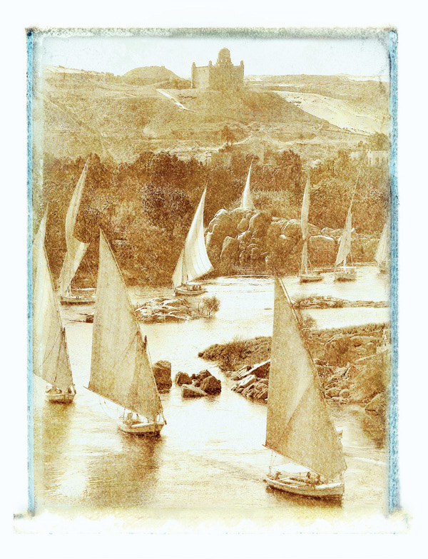
This image was originally shot in colour. As part of my workflow in Photoshop I always quickly preview an image in the Channels Palette looking at its three separate (RGB) colour channels, as displayed in grayscale. The original image often looks very different in just one channel. This difference is best seen and used if they are displayed in grayscale (make sure the setting in Photoshop’s Preferences has the “Show Channels in Color” box unchecked). This image used just the Red Colour Channel, copied to a Layer and blended with a blank Polaroid transfer texture and edge on the bottom Layer. Blend Mode set to Hard Light. Context - I feel the old world look of this image worked well with the subtle texture and faded edges of this background.
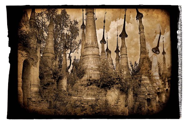
This is one of my favourite images and combines just the Red Colour Channel with a large format Polaroid edge and subtle stained paper texture. Context – I felt the Polaroid’s edge pattern echoed the patterning on the stupas and their umbrellas. The sepia hue and subtle aged paper texture visually reinforced the aged and decaying look this location had.
Article by Daryl Benson
| PHOTONews on Facebook | PHOTONews on Twitter |


