In the Spring 2019 issue of PHOTONews magazine, I shared how light position and height can help you create a certain mood in your portraits. This is the Behind The Scenes companion with technical information for you.
All images were taken with my Nikon D810 and Tamron SP 70-200mm f/2.8 Di VC USD G2, mounted on a Vanguard Alta Pro 2+ Tripod and Alta PH-32 Pan Head. For simplicity, I used one light – a broncolor Siros 800 S mounted to a Flooter – a focusable Fresnel light shaper that gives a light that is fairly hard with a touch of softness. You can achieve a similar look using a standard P65 reflector (which will be a harder light with more defined shadows) or a small softbox with no diffusion.
Short Loop Lighting
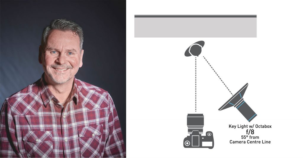
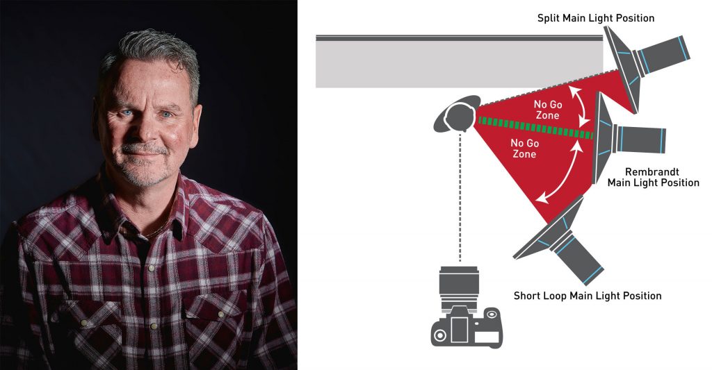
For Short Loop lighting, your Key/Main light is positioned on the same side your subject is facing and about 55° from the camera centre line. You’re trying to illuminate both sides of the face, but not the ear on the side of the face closest to the camera. The key to this lighting pattern is the shadow around the nose – a loop of shadow to give the face definition. Your fill light will add a little more detail to the shadows here.
The ideal height is just above your subject’s head and slightly angled down.
Short Loop Lighting is flattering on just about every face. For less harshness, you would add more power to your fill light. Try not to make your Key and Fill lights the same power, as this creates Flat Light and removes most shadows. You need to see there is a face there.
Broad Lighting
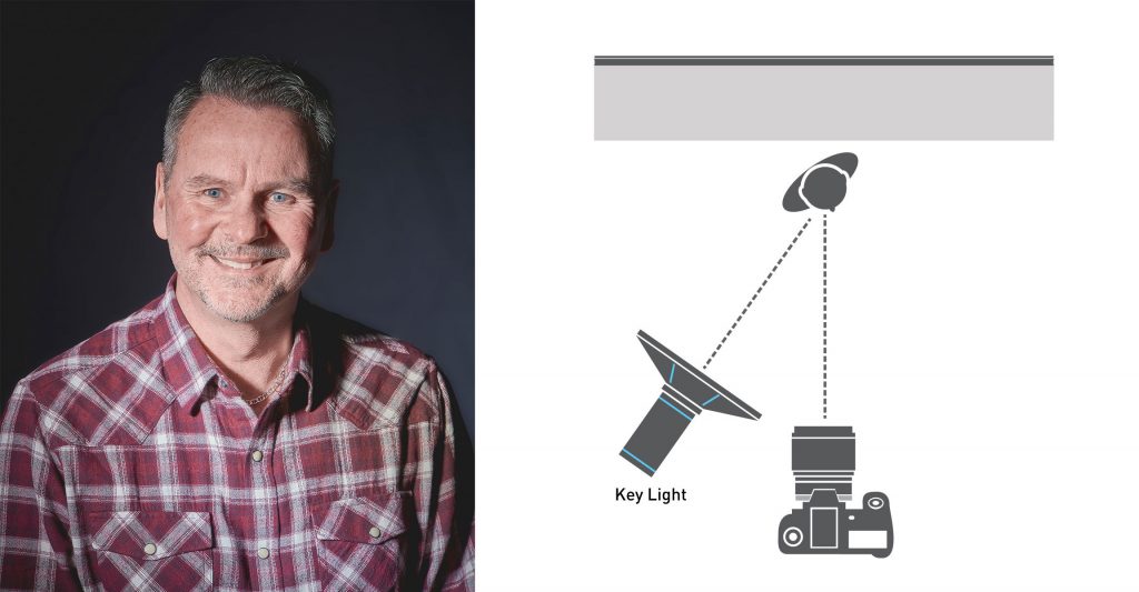
Broad lighting differs from Short lighting in that you’re illuminating the side of the face closest to the camera. The downside to this is that you can extend and broaden the face. You’re illuminating everything from the ear to the chin and around with no or little separation of features.
You’ve heard the saying “The camera adds ten pounds”? It’s not the camera that added the weight but the light! Since Broad Lighting brightens the side of the face closest to the camera, an area that can be quite large, and our eyes are drawn to the brightest part of an image, this lighting pattern isn’t the most flattering for many people. For smaller, balanced faces like Steve’s or narrow, oval faces, Broad Light is okay. If someone has a square or round face, or a fuller face, Broad Light can be very unflattering.
Split Light
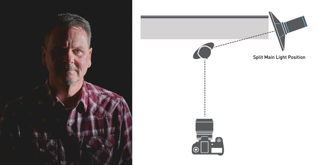
Split light only shows half the face – you should be able to split the face right down the middle. You’ll need some space to swing your key light around to the side of your subject – 90° degrees from their face. The trick is to get a nice line down the bridge of the nose. If your light is too far forward, you show too much of the nose; if your light is too far back, the face isn’t evenly split and you can get some odd and unflattering shadows around the eyes.
It’s also important not to raise your key light too high. Head height is perfect. You want that shadow line to remain vertical whilst splitting the face. Too high or low and the angle of the shadow on the neck and forehead will also angle.
Rembrandt Lighting
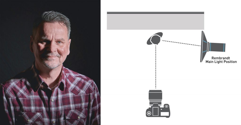
You can swing your Key Light back towards camera a bit for this classic Rembrandt Lighting pattern. Here, we illuminate a bit more of the face. The signature of this lighting pattern is that triangle of light on the cheek furthest from the key light and right under the eye. This can be tricky to light and pose, but the results are well worth the effort.
Height of your key light is also important. I tend to keep my key light just above the forehead and angled down. If your key light is too low, the triangle of light appears over the eye; if your key light is too high, the triangle disappears or becomes unusually long.
The No Go Zone
There’s one place where lighting can look sloppy – what I call the “No Go” zone. It’s between the Short lighting and Rembrandt lighting positions and between Rembrandt and Split lighting positions. It’s that in-between place that creates odd shadows on peoples’ faces.
In the above image, the shadow along the centre of Steve’s face runs from the eyebrow down to the corner of his mouth – it’s one dark “blob” that makes his nose look bigger and stretched to one side.
Sinister Lighting
Very dark and dramatic, Sinister Lighting as I call it tends to ruin crime and mystery shows for my wife and I. Whether it’s one of my favourite Netflix series (Daredevil – watch the scenes with Kingpin) or any of the crime dramas, the writers may want you to think you know “Who done it” but the gaffer and grip (lighting technicians on set) are the ones who really showed us the culprit.
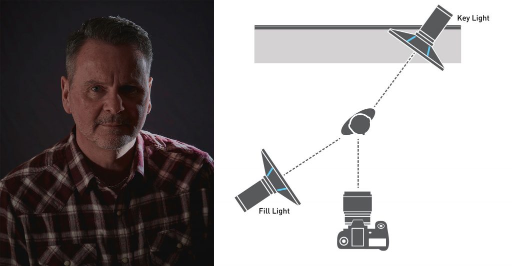
Sinister lighting is apparent due to the strong highlight coming from behind your subject. Sometimes, the light is strong enough to blow out the highlights completely. There is usually a soft fill (I like to use a large reflector or a large umbrella) coming from the other side to show the face and allow to read that the mouth is moving and there’s a face in front of you. Think of this as a Rim Key light. And try to watch your shows in a different light!
Height of your Lights
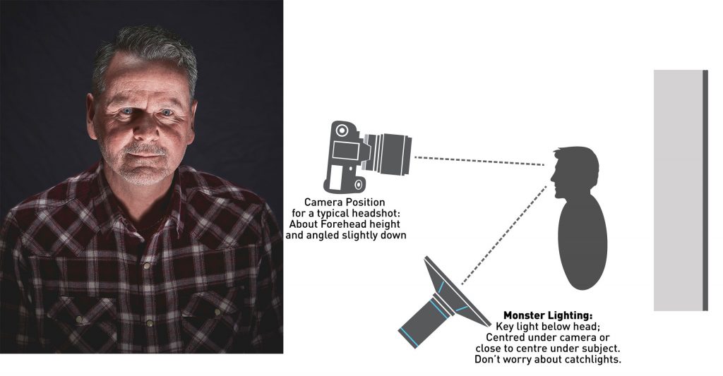
Any time you have your key light down low and aimed up, you’ll get Monster Lighting. The shadows create an intimidating look, no matter your subject. The eyebrows and cheeks will create dark shadows above them – making both the eyebrows and eye sockets appear larger. Steve’s button up shirt creates a dark “V” shadow on his neck, which always reminds of classic Dracula films. In this image, light bounced off the ceiling to give a bit of fill.
Paramount or Butterfly Lighting
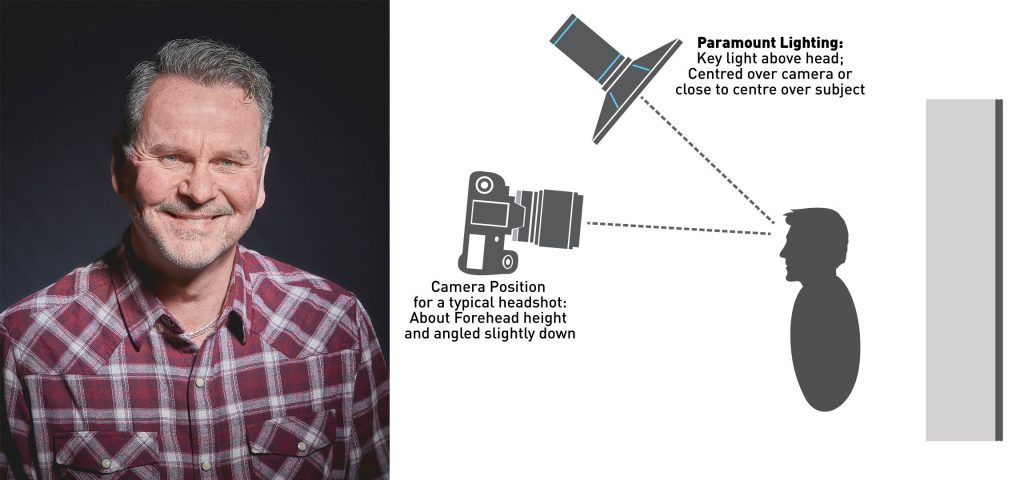
For Paramount of Butterfly Lighting, your key light is positioned fairly high above your subject. You can have it centred or slightly to one side of centre in relation to your subject. We look for two things when setting our lights for Paramount lighting – the signature “butterfly” shadow under the nose and catchlights in the eyes. If your light is too high, the “butterfly” extends onto the mouth and you lose the catchlights; if your light is too low, you don’t get the nice shadow.
About the Author – Will Prentice (www.capturaphoto.ca) is a professional photographer based out of Whitby, Ontario and Brand Specialist – Lighting for Amplis.


